The health of a nation is often measured in economic terms – how much a country chooses to spend, where that money comes from, what it spends it on and how much that money translates into quality of care.
This infographic shows how health expenditure, access to care and health outcomes compare with seven other OECD countries.
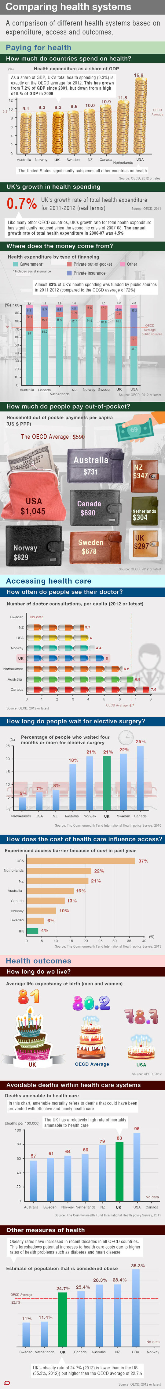
![]()
This article was originally published on The Conversation
Read the original article.
About The Authors
Emil Jeyaratnam has a background in documentary post-production and has credits on documentaries for the ABC, SBS, and BBC, amongst others.
Jo Adetunji is Assistant Editor for Health and Medicine section. She has worked at the Guardian, The Times, The Independent and Telegraph newspapers.


 Affairs")